How to Make Your Website More Enjoyable (So People Will Buy From You Online)

So you've spent a bunch of money trying to get people to buy from your website, yet you haven't seen any sales increase. People come to your site only to leave again after a few seconds. They don't even bother to click on any other pages, let alone make a purchase!
That's a bummer, no?
What might have gone wrong?
Why don't people enjoy browsing your website?
Let's go through the possible reasons.
What people don't like about a website
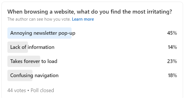
People's preferences and dislikes about websites can vary, but some common mistakes tend to make users abandon a site. Check out this poll that I did on my LinkedIn a little while ago.

Other things that I've noticed people don't like about a website include not having mobile optimization, overloading with information, keyword-stuffed content, and annoying visuals. If you spot any of these mistakes on your website, let me guide you on how to fix them.
Fixing common website mistakes
If people don't enjoy browsing your website, they won't buy from you online. Period. That's why if you suspect your website might have made any of those mistakes, let’s fix them so your site can be more enjoyable.
1. Fix annoying pop-ups
For me, a huge pop-up window covering the whole page that appears right after you open the site — with a teeny-tiny, low-contrast X button that you can barely spot — feels like a trap. I honestly don’t like it and many other people share this resentment.
If your website still has this kind of pop-up, remove it. Avoid any pop-ups if possible. But if it’s crucial to have one, use a smaller window that can be closed by clicking anywhere outside the box. Let people scroll around for a bit before popping it up and only show relevant content on it.

2. Deliver the right size of information
The content on your website needs to be easy to digest, not a novel to read or pages of cluttered information. That would leave people feeling confused and overwhelmed. Quality over quantity, always.
Provide enough information about your business, services, and products on your website. For example, compare these two homepage hero banner headlines:
Unlock New Markets and Drive Growth
End-to-End Marketing Solutions for Prominent Global FMCG Brands
While the first headline is shorter, it doesn't explain what your business offers. The latter is not overly long either and it contains the main information people need to know when they've just arrived at your homepage: your offers and your target audience.
3. Improve your site speed
We all have little patience for slow-loading pages, and it could even hurt your search engine rankings if you’re big on SEO.
Optimize your website by reducing image and video file sizes, enabling cache, and using content delivery networks (CDNs). Avoid having autoplay videos or sounds. And don't forget to review your page load speed every month.
4. Fix any confusing navigation
We always get a little frustrated when a website makes it hard for users to find what we need. And I have a surprisingly easy trick to fix that: by limiting the navigation on the header menu.
The rule of thumb is to not go over five items on the menu. Generally, they are Home, About, Products or Services, Blog or Resources, and Contact Us or other call-to-action you're focusing on. Anything beyond that is simply getting too complicated, and you can then cascade down your hierarchy of information from there.
5. Optimize for mobile
If your site is static, consider setting aside time and resources to upgrade to a responsive one. Responsive websites can adapt to different devices and screen sizes, so you don’t have to re-layout everything manually one by one. It also improves your user experience and builds your brand’s integrity across platforms.
6. Display engaging content and visuals
If you have the budget and resources, I really recommend having a photoshoot as it can capture your real brand image and emotion. Stock photos and digital imaging would be the second best choice, but steer clear of unrealistic, heavily staged images.
Follow SEO best practices and avoid keyword stuffing — it makes your content a nightmare to read. And stay away from flashing animations that could trigger anxiety and distraction, especially if they serve no purpose other than to look pretty.
Bonus tip: Improving accessibility
Today, it is more necessary than ever to create digital products that cater to a diverse user base. First and foremost, keep everything simple. Use plain language. Avoid jargon, complex terms, sarcasm, and ambiguity. You can also add alt text for images, use proper heading structures, and add captions and subtitles to videos to make your website more accessible to all.
An accessible website is more enjoyable for all. An enjoyable website will lead to improved online presence and sales because people always trust a well-designed website with a delightful user experience more than a lagging, awful-looking one that frustrates them. Start taking your website game more seriously and you’ll have better online presence and sales.

